- Slug: Sports-Suns Sunburst Jersery, 1,739 words
- 2 photos available
By Tom Aizenberg
Cronkite News
PHOENIX – In the early 1990s, with the Phoenix Suns preparing for the franchise’s 25th anniversary season, Tom Ambrose pulled out a rubber chicken during a meeting of club executives.
“You’re probably wondering what this is,” Ambrose, the team’s executive president of marketing at the time, told the gathering. “But the key to this meeting is: Don’t be chicken.”
It was a time of dramatic change – and risk-taking – for the Suns franchise. It was no time for the chickenhearted.
The team was preparing to move from venerable Veterans Memorial Coliseum to a sparkling new America West Arena in downtown Phoenix. Managing partner Jerry Colangelo and coach Cotton Fitzsimmons were working on a blockbuster trade to add Charles Barkley to a team that already included stars such as Kevin Johnson, Tom Chambers and Dan Majerle. Fitzsimmons was preparing to move to the front office, elevating his hand-picked successor, Paul Westphal, to coach. And to go along with it all, the Suns wanted a new look.
Hence, Ambrose and his chicken.
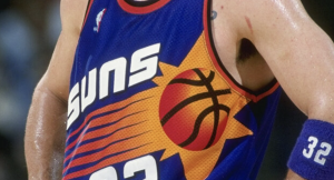
Like most NBA teams of the era, the Suns wore uniforms of a simple design. Colangelo decided that the Silver Anniversary 1992-93 season provided the perfect opportunity to rebrand the team. So in a bold step, the Suns trash-canned their original, western-themed uniforms and unveiled what is now known as their “Sunburst” look.
“Well, you only have opportunities every so often to kind of redo. … It was time,” Colangelo said. “It was just time for us. And what better time than when you are opening up the newest, latest state-of-the-art facility in the country?”
To pay homage to that era and those uniforms, the Suns are celebrating the 30th anniversary of the 1992-93 team this season, and will debut their throwback “Sunburst” alternative uniforms on “90s Night” Tuesday night, when the defending NBA champion Golden State Warriors visit the Footprint Center. It is the first of 12 “throwback” nights the Suns have planned this season.
The original Sunburst design made its debut during the club’s regular-season opener against the Los Angeles Clippers on Nov. 7, 1992. The Suns won that game behind Barkley’s 37 points, 21 rebounds and eight assists. It launched a 62-win season that ended just short of an NBA title when the Suns fell in Game 6 of the 1993 NBA Finals to Michael Jordan and the Chicago Bulls.
The stars literally aligned for the Suns to rebrand with the arrival of Barkley to a team led by Johnson that created one of the most dynamic offensive duos in the NBA.
But the rebrand was underway long before the Barkley deal was in the works.
“I remember very vividly saying, ‘If we’re ever going to do it, this is the time,’” said Rich Dozer, the Suns chief operating officer at the time “Now, when we’re having those discussions, we do not know Charles Barkley is coming. We do not know we are going to trade for him.
“With NBA rules, when you’re going to change your logo or your uniforms, you have to do it way in advance.”
The designs had to be finished well before the 1992-93 season because the NBA produces replica jerseys overseas and they must be manufactured and then shipped to the U.S. So jerseys often had to be designed and ready for production up to 18 months before teams unveiled them.
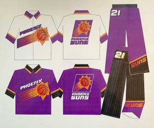
To create the jerseys, the Suns reached out to another dynamic duo, graphic designers Tom O’Grady and Kevin McGraw. The pair would later help design uniforms and branding for the Vancouver Grizzlies – now in Memphis – and Toronto Raptors when those teams joined the NBA later in the decade.
“The Suns reached out to us and said, ‘Oh, we have a 25th anniversary coming up in 1992-93 when we want to redesign our uniforms and logos, and we really don’t know who to go to,’” O’Grady said. “And that’s when (Commissioner David Stern) reached out to me and said, ‘Do you have any experience with this stuff?’
“And of course, I played dumb. I’m like, ‘Yeah, I do!’ But nobody had any experience doing that.”
O’Grady and McGraw joined Colangelo, Ambrose, Dozer and Ray Artigue, the team’s marketing director back then, on the redesign project.
The first step, and arguably most important step in rebranding, is coming up with a strong idea,” McGraw said. “That was my favorite part of the whole process – the concepting, when Tom (O’Grady) and I would be working out ideas.”
Originally, the design of the sun on the jersey was meant to look like a sash that resembled the “Blaze” design worn by the Portland Trailblazers, with the sun descending across the body.
However, Colangelo had a more optimistic outlook in mind.
He wanted the logo to reflect the Suns as a franchise that was trending upward, not setting. So the new logo became a rising sun that fans still associate with the team.
Another key concept was the color scheme. While the Suns have always had purple and orange as the primary colors on their palette, it wasn’t necessarily ideal 30 years ago. There was concern that purple jerseys often did not appear purple on television. Instead, they looked dark blue.
“Purple is a bad color for television,” Dozer said. “We were trying to minimize the purple, but we didn’t want to get away from it.”
True to the chicken challenge he laid down to the executive team, Ambrose threw out a not-so-modest proposal that was inspired by the most popular American sports team in the early 90s, the NFL’s Dallas Cowboys.
“I still wanted to make sure we explored all options, so I threw out another option of maybe dark blue and silver just to see how that would go,” Ambrose said.
Spoiler alert: It was received about as well as his rubber chicken.
“Well, first of all, because it was Tom who came up with that crazy idea, I just dismissed it,” Colangelo said. “Because I had no interest in blue and silver. The orange and purple had everything to do with sunsets in Arizona.”
Unlike blue, purple is not a common color in sports. Keeping their traditional colors helped the Suns stand out in the pro sports universe.
It also was important for the team to maintain its connection with the city and state. The Suns were the first of the state’s major professional sports franchises, arriving through NBA expansion almost 20 years before the Cardinals relocated from St. Louis.
“Phoenix is a Phoenix Suns town,” said former Suns reserve Tim Kempton, who played on the 1992-93 team and remains with the club as a radio broadcast analyst.
Since the Suns were the city’s first pro sports love, it was important for Colangelo to cultivate that relationship by keeping the purple-and-orange scheme.
But creating a multi-colored design with the new Sunburst logo was no easy task. At the time, jerseys were typically created by stitching logos and letters to a jersey, making complex designs difficult. It also made the garments heavier and restricted the movement of the players.
But in the early 1990s, “heat sublimation” opened up new possibilities in uniform design.
“Technology was rapidly changing,” O’Grady said. “In 1985 … we couldn’t have designed the uniforms for the Suns that we did because the technology to put super graphics and have Photoshop on these garments was not in existence yet.”
The sublimation process works like printing. Jerseys start off as plain, white garments and are infused with designs created on Adobe Photoshop and transferred by heating up the jersey. This way, a designer can add multiple graphics without adding any extra material.
“This technology is crazy,” O’Grady said. “We were trying to figure it out because it was exploding. Yet, Kevin and I were working with pencils and markers, so we had to figure out how to transition from these beautiful sketches that Kevin was doing into Photoshop.”
Once the jersey design was approved and completed, the Suns received a sample of the new uniform. There were no players around to model it, so Dozer was drafted to don a jersey.
Ambrose and the others decided to use a photo of Dozer in the top-secret project to pull a prank on him.
“We had them do a 4-by-8 (foot) photograph of Dozer wearing the uniform, and we put it up in an area where we knew he would be coming in from the parking garage and he would see it,” Ambrose said. “And he did, and it was great and we had a good laugh.”
However, the Suns intended to keep the jersey a secret until the debut on opening night of the 1992-93 regular season, and the poster-sized prank backfired, according to Ambrose.
“Shortly thereafter, a reporter from The (Arizona) Republic came in, following the same route, and saw the picture,” Ambrose said. “He calls a photographer over at the paper, and he comes over and takes a picture of it. I find out about it, and I called and begged them not to run the picture of Dozer.”
The team managed to keep the jerseys under wraps until the eve of their debut, and they were an immediate hit with fans. When the team unveiled an alternate black version of the jersey in 1994, it was an even bigger hit.
“We added a third color, an alternative jersey,” Artigue said. “Our black jersey really made for a lot of excitement for our fans. That, coupled with a tremendous team, had jerseys and all kinds of merchandise just flying off the shelves.”
The Sunburst jerseys remain popular to this day, so the Suns decided to bring them back. Often, teams roll out throwback jerseys or new alternate looks to bolster merchandise sales when a team is struggling on the court.
“A lot of times, you have celebrations and you look back in history when things are not going well with the team (in the present),” said Suns broadcaster Tom Leander.
Not so with the Sunburst uniforms.
The Suns are coming off the best regular season in franchise history. And the core of that team remains intact. It includes All-Stars such as Devin Booker and Chris Paul along with rising young players such as center Deandre Ayton and lock-down defender Mikal Bridges.
And, like their fans, the Suns evidently have an appreciation for the classics.
“The Barkley Sunburst, I like that,” Booker said. “It’s my favorite one. I’m excited about it.”
For more stories from Cronkite News, visit cronkitenews.azpbs.org.

